There has been a lot of interest from folks to either paint their home’s door to match a modbox color or make sure their home’s current color scheme will work with a color. In this blog I provide photos and a table that will help you obtain color perfection.
Update: in late 2018, modbox brought powder coating in-house, so we have color sample plates! If you use a grade of paint different from the grade we used for color matching, you can now order a sample color plate to have color matched anywhere! Click here to get a sample color plate.
What is the ‘true’ color? At the end, I provide cautionary notes regarding how colors vary on computer screens along with a general description of each color (much like describing a wine).
To help out, I had the metal powder coated samples color matched at Benjamin Moore. The formulas are provided in the table (click here for a .pdf of the table). In addition, I crafted a sample paint board where I painted each color and attached the metal powder coated samples. I used the ‘Ben’ gloss finish paint, this is their mid grade #543 paint.
Caution: a modbox owner used the color matching table below with the top of the line Benjamin Moore paint and it did not match! So, if you use something other than #543 you’ll need to take the mailbox to BM to get the color matched.
Guidance on turquoise, from a modbox customer: “Amazingly, the color is darn-near identical to the door. The only real difference is the sheen, but when I held the mailbox next to the door, it looked exactly the same. It’s a low-sheen Dunn Edwards Suprema paint that was color-matched to Behr ‘Mermaid Treasure’… in case that might help someone.” From another customer in 2019, Sherwin Williams’ SW6768 Gulfstream is a very close match too.
I took a picture in direct late afternoon sunlight and in the shade. The color matches look great!
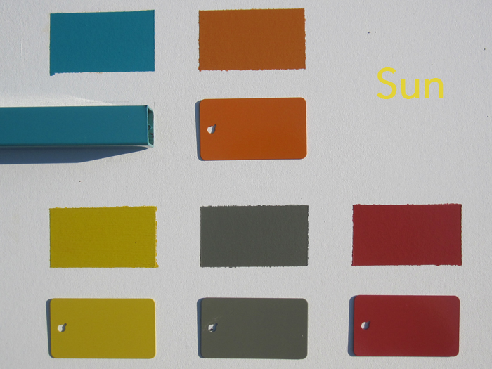
In order to get a print copy of the most ‘true’ color, you can click on each photo to get a download of the .jpg file [or click here: sun | shade]. Then you can take the digital file to your local photo processing store. You can set the sunlight or shade photo next to your house when the lighting conditions match. Don’t forget, most doors will be 15′ or more away…so, it does not have to be exact!

The table provides the RAL color number and the screen capture of the color from the powder coating supplier’s website. The RAL colour standard is a color matching system used in Europe and adopted by most powder suppliers. I’ve found that each supplier’s matching to the RAL standard varies. 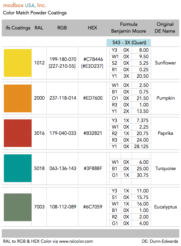
The RGB and HEX numbers are shown in the table too. RGB is an additive color model in which red, green, and blue light are added together. HEX is used in computing applications like the web to represent colors. The RGB and HEX values were obtained from www.RALcolor.com.
Note on Sunflower: the screen capture color was ‘off’ relative to the metal powder sample. So, my son and I adjusted the color until it matched the sample. The resulting RGB and HEX are shown in the table within brackets.
What is the true color?
Sun versus Shade Variation. As shown in the photos above, the tonal qualities of each color varies with variations in lighting. The powder coated finish is a high gloss, so the variation is amplified. The colors can appear very bright in direct sun, yet become almost dark in the shade or low light.
Computer Screen & Photos Variation. Due to variations in the quality and calibration of computer screens, the color can appear very different. Further, camera settings, the color of background surfaces, the quality of the sun where the photo was taken – all of these things affect the perception of the color on a screen. The RGB and HEX formulations are perhaps of little help, as they frame the color in a screen context. Yet the mobox reside in a physical world!
External Representations? I wish I could tie the colors to external representations. For example, a Pantone color or Benjamin Moore color so that folks could get a color card or brochure. Unfortunately, there is no direct match to the RAL color standard used for powder coating.
Color Description/Notation. Perhaps this section will be the most useful. If you purchase a modbox and wish to help describe the color, please send me an email! Here goes.
Turquoise: this is a traditional turquoise with a balance of blue/green. The tendency is towards blue. Think, Miami Dolphins. Eucalyptus: more grey than green, even though the name suggests more green tones (the green is very subtle, RAL name is Moss Grey). Paprika: this is a mellow red (while not pastel, there are hints); the photos and screen colors tend to make it appear darker then it is (RAL name is Coral Red). Pumpkin: this one can appear bright in direct sun, but in mellower light moves more towards the classic color of a real life pumpkin. Sunflower: this one can also appear bright in direct sun, but takes on a somewhat warmer tone in mellow light, although still seems brighter than a real life sunflower in shade (RAL name is Lemon Yellow).
I hope this helps. If you have any suggestions for improving this blog post/guidance, send me an Email. Email Greg
